basicpercentages
Smart visuals, better insights

Chart Types

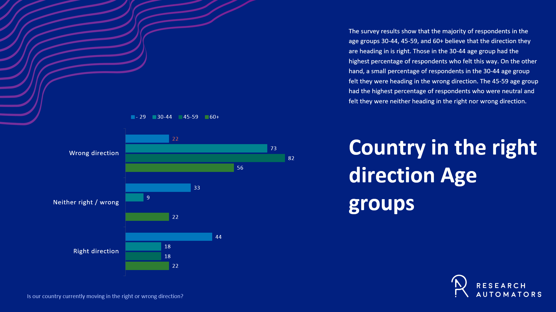
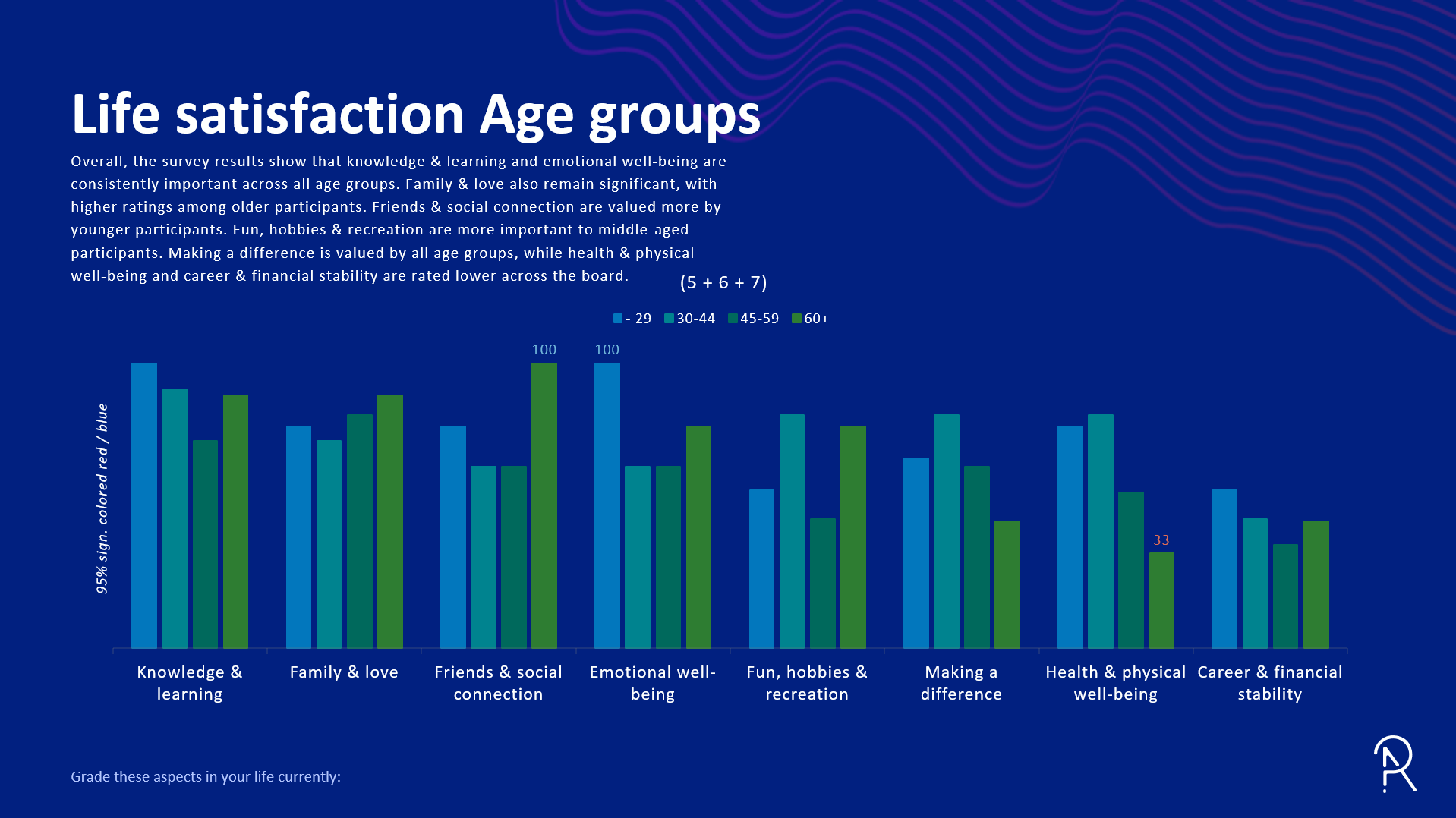
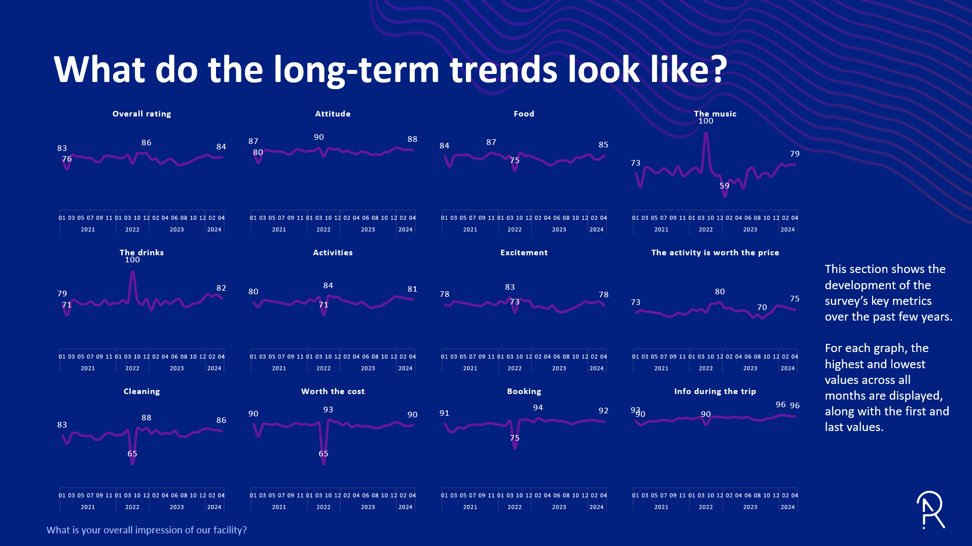
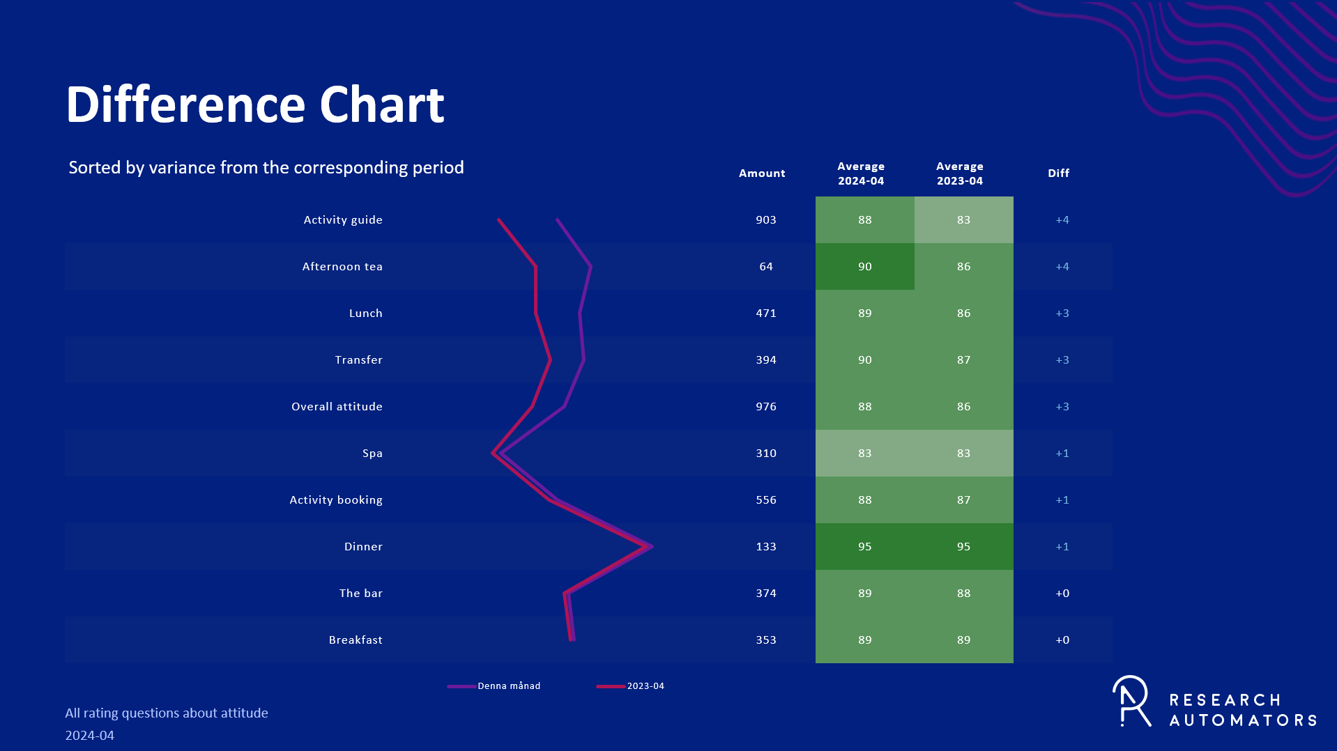
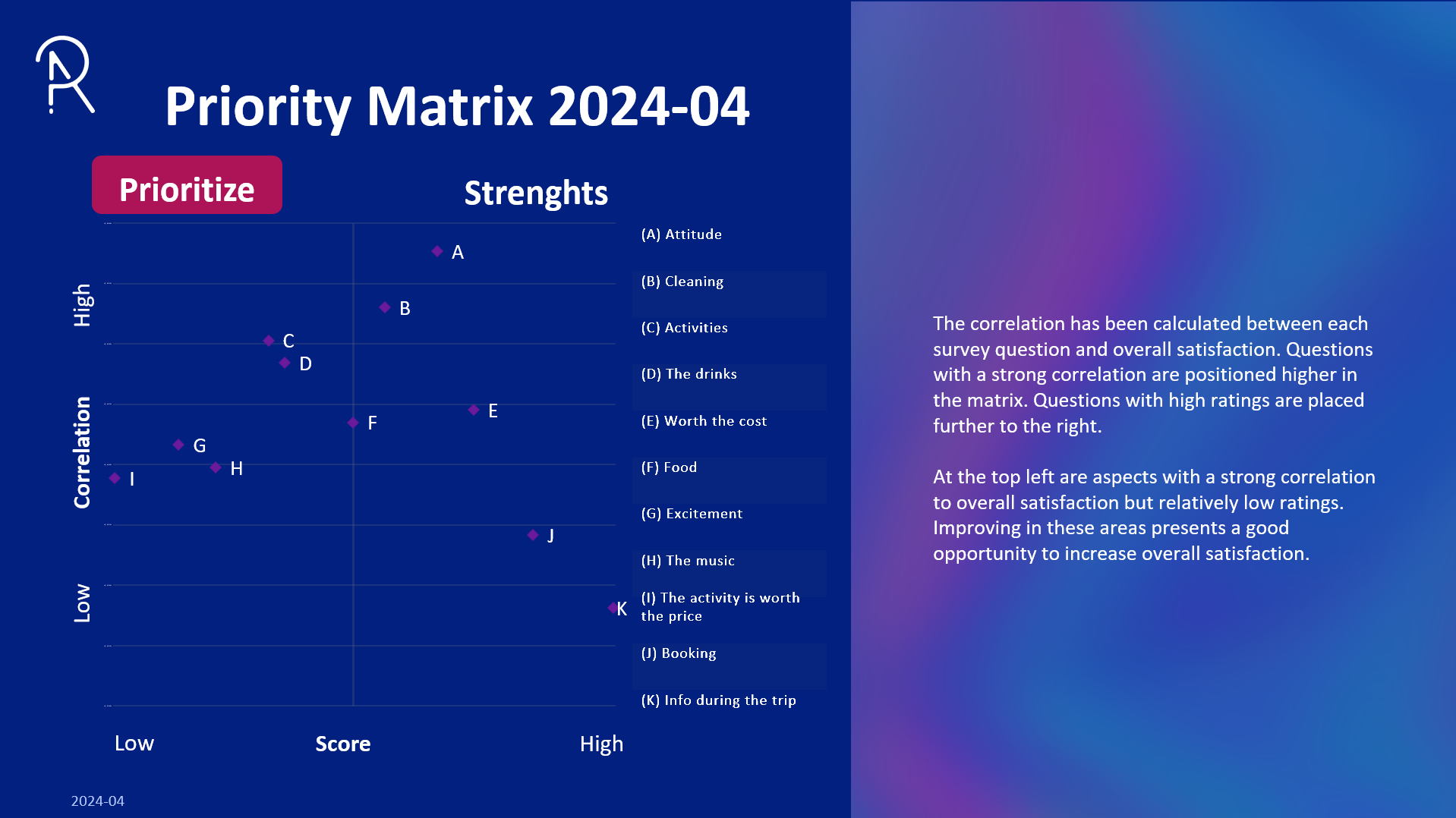
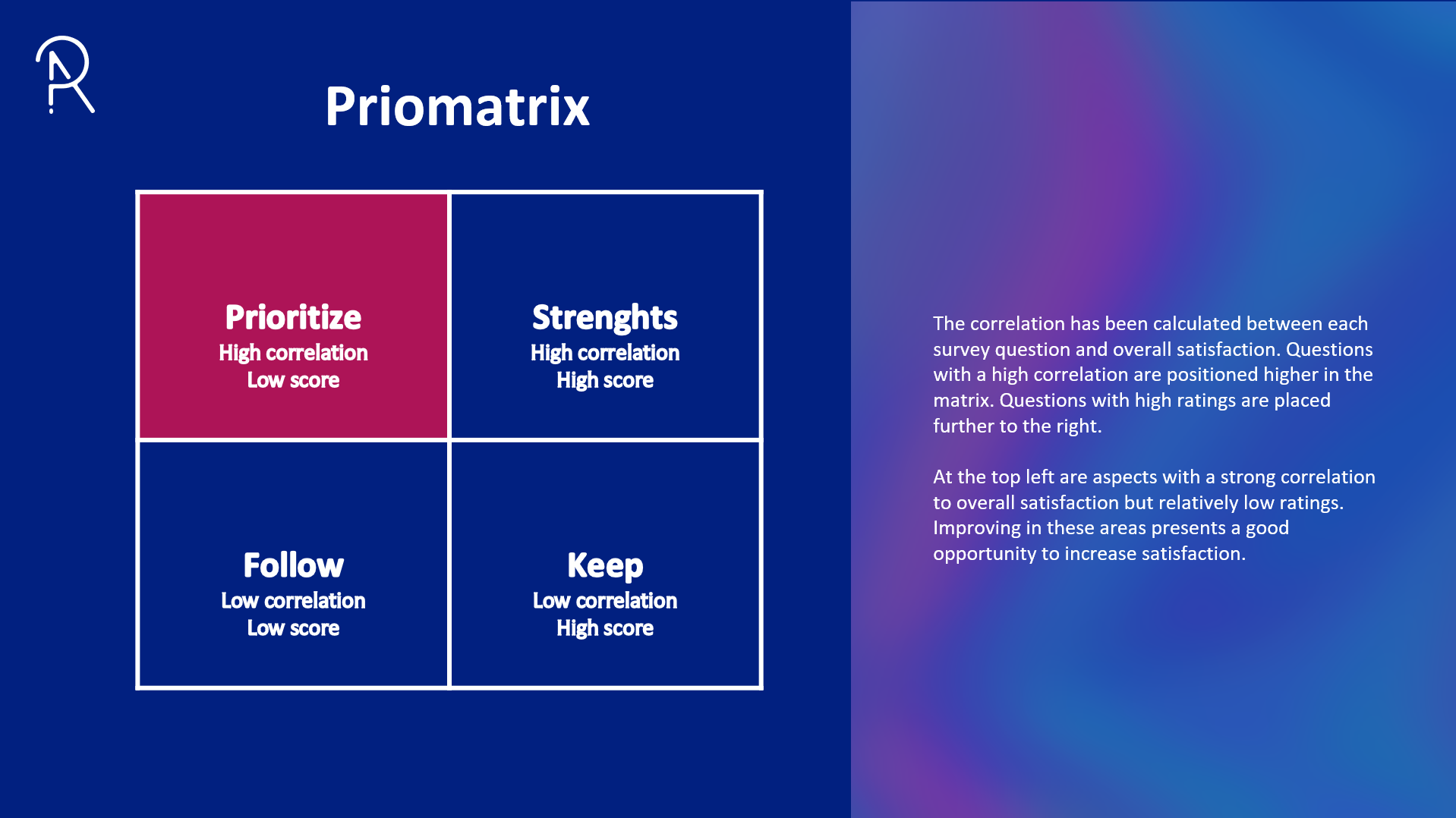
Survey Automator supports a wide variety of chart types to visualize your data clearly and effectively. From quick bar comparisons to detailed 360° radar charts, each type is designed to highlight key insights with minimal effort. Below, we’ve grouped the most commonly used chart formats to help you choose the best visuals for your report’s purpose.

Basic Charts

Simple and effective formats for showing distributions and scores. Use grouped or stacked layouts to compare results between categories or show proportions within each group. Ideal for most standard survey questions.


Scale & Rating Charts

Summarize agreement levels, satisfaction scores, or other scaled responses. Use average bars, heatmaps, or stacked scales to highlight patterns and intensity across multiple items or over time.


Comparative Charts

Designed for comparing results across key segments. Side-by-side layouts and difference charts help you spot gaps, trends, or outliers between groups or survey waves.


Insight & Impact Charts

Designed to surface what matters most. These charts combine satisfaction, frequency, and correlation to highlight key drivers, strategic gaps, and patterns behind open-ended feedback.


Not ready or unsure if the platform is right for you? Let us start with a small research project that we set up and manage for you at a fixed price. We will show you what opportunities are available directly in the platform without the need to commit yourself:

Talk to us

  • By “Submitting”, I agree that my information is handled in accordance with the privacy policy.