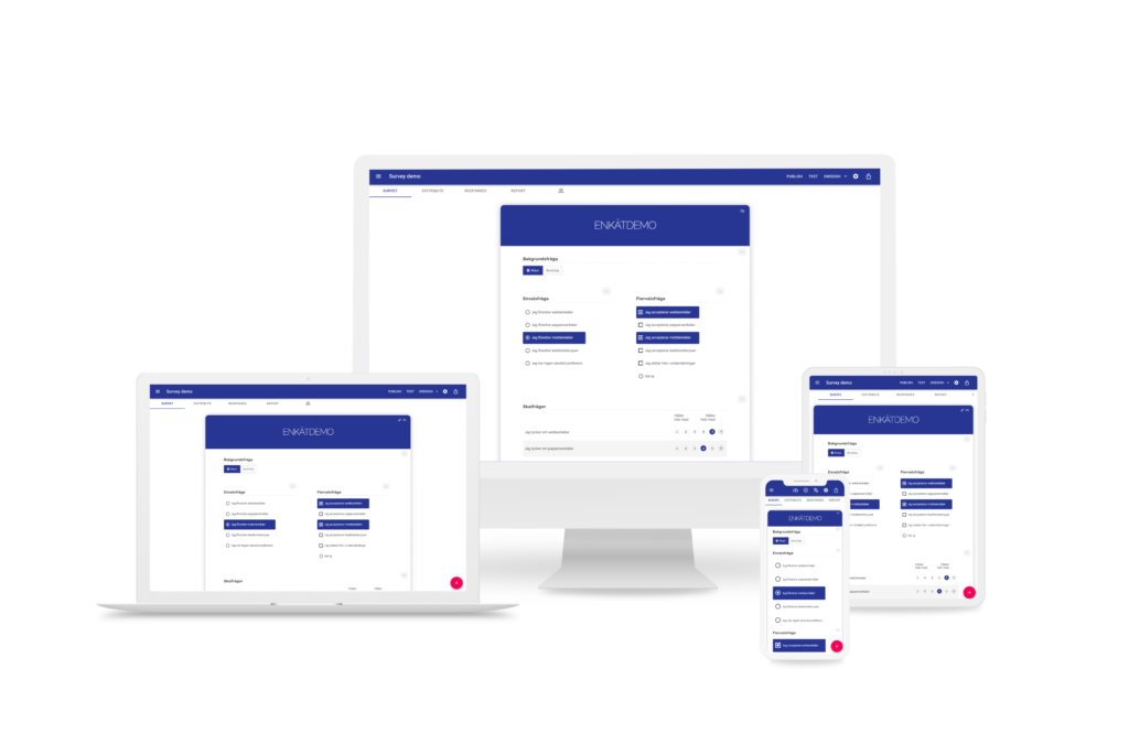
Single Select | Respondent selects one answer. Displayed as buttons, radio buttons, or dropdown. Ideal for clear, exclusive choices. |
Multiple Select | Respondent can select multiple answers. Ideal for “Select all that apply” formats. Exclusive answers like “None of the above” are also available. |
Button | Displays answer options as clickable buttons, where only one answer can be selected. Often used for clean, mobile-friendly single-select interactions. |
Dropdown Select | Presents answer choices in a dropdown menu. Saves space and is especially effective when listing many options, such as countries or years. |
Likert scale | Shows a grid with standard scale points (e.g., Strongly Agree → Strongly Disagree) for rating multiple statements in a consistent way. |
Button Grid | A matrix layout where respondents answer each row using clickable buttons. Ideal for rating multiple items side by side with fast, touch-friendly input. |
Vertical Grid | Displays a compact question matrix with answer options arranged in columns and items in rows. Ideal for efficiency when asking repeated questions. |
Sliders | Provides a movable scale where respondents can slide to choose a value. Great for measuring intensity, satisfaction, or probability. |
Open Comment | A simple open-ended text field for collecting thoughts, ideas, or explanations. Common for follow-up questions or general feedback. |
Open Numeric | Accepts numeric input only. Supports validation like minimum/maximum values — great for age, quantities, or scoring questions. |
Multi Comment | A grid where each row collects one open text response. Useful for gathering written feedback on several items in a compact format. |
Multi Numeric | Captures numeric input across multiple items in a grid layout. Each row allows a number entry, ideal for collecting scores, amounts, or time spent across categories. |
Drag and Drop | Lets respondents move items between multiple target columns or categories, not just sort them. Used for sorting, grouping, or classifying items into buckets (e.g. matching, categorization, multi-priority sorting). Each column can represent a meaning, such as sentiment or category. |
Ranking | Displays a two-column layout: one with items to rank, and one with ordered placeholders. Respondents drag items into ranked positions (1st, 2nd, 3rd, etc.). Designed for clear priority ranking — not grouping. |
Contact Info | A grouped input that collects personal details like name, phone, and email in a structured format. Fields include built-in validation to ensure clean data. |
Header | Inserts a large, styled section title into the survey. Visually separates parts of the form and improves flow in longer surveys. Great to add after a page-break. |
Text Info | Non-question content used to provide information, instructions, or context. It appears inline with the survey flow but doesn’t require any response. |
Screen Out | Ends the survey immediately for disqualified respondents. Triggers based on a logic condition and displays a custom message to the user. |
Info Message | Displays a dynamic message during the survey based on a specific condition — without blocking progress. Used for soft guidance or context. |
Error | Used to enforce logic-based validation. Shows a blocking message if a rule is broken (e.g., one value must be higher than another). |
Language Selection Buttons | Presents clickable buttons at the start of the survey for selecting a preferred language. Automatically switches the entire form to the chosen language. |
