
Stop cutting and pasting!
Automated PowerPoint reports. Faster delivery, no errors.

Don’t re-invent the wheel
In our platform you don’t need to build reports page-by-page for every study. It’s truly automated!
Choose one of our report templates or let us implement your standard report. Add your data to the platform and your report will be ready to download in next to no time!

Automated PowerPoint reports. Faster delivery, no errors.
In our platform you don’t need to build reports page-by-page for every study. It’s truly automated!


Regardless if you need to create many similar PowerPoint slide decks (e.g. hierarchical reporting – one per organisation, country, department, or manager) or just one report packed with charts – our platform will do the job!
If you are not using our platform to conduct your survey – just import data from an SPSS (.sav) file.
Watch the video to see the process from import to report.
“Reporting-only” users
(no data collection / survey features)
Extra credits / usage
13.5 € / report above maximum per license level (i.e. 1, 10 or 30).
0,5 € / extra data row above license level.
Our reports works regardless of your survey questions.
Here are some example reports.

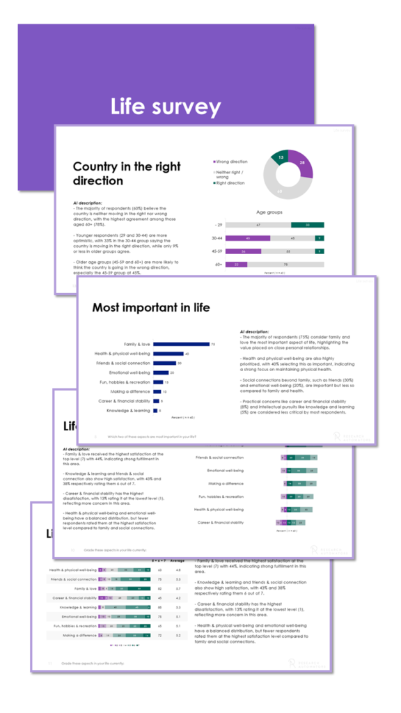
A PowerPoint template designed for analysts who want to add insights to each chart.
Dedicated space for commentary and interpretation.
Pre-filled draft texts using AI based on your chart data.
Analysts can edit, expand or rewrite AI suggestions freely.

This report template makes it effortless to identify similarities and differences across various subgroups.
The “Top 2 Box” metric is used to describe positive attitudes among respondents.
Segments with significantly higher/lower values are highlighted.

Easily compare your scores. The colour of charts and tables in this report are based on the averages.
Darker green means higher average, red means lower average.
Instead of displaying the values of previous study we calculate the differences / delta and colour negative development red and positive development green.

This pedagogic report is structured in sections. Each section set out to answer a question, like “In which areas did improve/worsened compared to previous study?” or “In which areas are you below or above the company average?”.
This way we help the report recipient identify the most important areas in need of development.
Pinpoint areas with the greatest discrepancy between groups.
Justify through ranking lists showing the strongest departments at the same or underlying levels.
Inspire by showing the biggest positive changes since the last measurement.

This basic PowerPoint report shows the percentage distribution of each survey question.
You get a mix of pie charts, column charts, bar charts and answer clouds. The type of chart is based is based on visualisation best practices.
Open ends / verbatim are also included in the report.

As part of our onboarding process, we implement your PowerPoint theme so all reports you download from the platform is in your corporate design.

Can’t find a report template that you like?
Do you want to pick and choose from several templates?
Want us to replicate your current reports?

Need cross-tabs in Excel?


An SPSS .sav file is the standard format in which you typically save your SPSS-files. This format includes all the information we need to convert your data file to a first-class PowerPoint presentation. We can also manage other file types, but the .sav file contains all the necessary information to ensure nothing gets lost or misinterpreted.
For most survey tools, the answer is yes, but they need to be able to export data in the SPSS .sav file type since this format works best with our report templates. The following survey platforms support exporting to SPSS .sav:
SurveyMonkey
Qualtrics
QuestionPro
Forsta
Askia
Netigate
Your data and reports are stored and can be downloaded up to 12 months from the creation date. If you have a platform license, the data is kept until you either delete it manually or terminate your license.
Yes, you can use the themes in our report templates or your own corporate theme. Using your own PowerPoint theme comes at an additional cost of 400 € (one time cost).
Yes! Once you have sent us the information and data file, we will create a draft of the PowerPoint report based on our report templates. This draft will be presented to you during a video meeting where you can give us feedback and we make adjustments to the PowerPoint as needed. Once you are satisfied and have agreed to the costs we will send the PowerPoint report to you.
We offer several different PowerPoint report templates designed to inspire and help you display a wide variety of data clearly and concisely. They can be used for market research, employee satisfaction surveys, NPS studies, and 360-degree feedback.
There are two templates that might serve your purpose, mainly depending on how you wish the data to be displayed.
A segment comparison report is a good choice for identifying similarities and differences between the different subgroups. Segments with very high or low averages are highlighted for even easier identification.
The Coloured Averages report lets you display averages across subgroups. The averages are colour-coded so that darker green shows high results and red means lower results.
All our PowerPoint report templates are available on our website; getting access to them is very simple.
1. First, you choose what template you would like to display your data.
2. Secondly, you upload your data files, which we then use to populate your report.
3. Thirdly, you preview the report and inform us of any changes you want to make.
4. Finally, you download the report and use it as you wish.